
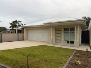
Exterior painting requires suitable weather conditions to achieve a smooth, durable finish. Learn how temperature, humidity, rainfall, wind and sunlight...
How to Choose the Right Paint Colour for Your Home: Tips & Advice

TABLE OF CONTENTS:
- Introduction
- Why Choosing the Right Paint Colour Matters
- How to Choose Paint Colour: Start With the Room
- Look at Natural Light
- Pay Attention to Undertones
- Consider the Size of the Room
- How to Choose Exterior Paint Colours
- Create a Colour Flow Between Rooms
- Test Paint Colours Before You Commit
- Feature Walls: When They Work and When They Don’t
- Painting Services in Adelaide
- Frequently Asked Questions
Introduction
Choosing a paint colour sounds simple until you stand in front of dozens of colour cards and realise that the difference between two shades can be surprisingly difficult to see.
A white can look warm in one room and cool in another. A grey that looks sophisticated on a small colour card can appear completely different across a large wall. Even a colour you love in someone else’s home may not work the same way in your own space.
So, how do you choose the right paint colour for your home?
The answer is not simply to choose whatever colour is currently popular.
The best colour depends on the amount of natural light, the size and purpose of the room, existing flooring and furniture, architectural features, exterior materials and the overall feeling you want to create.
For Adelaide homeowners, there is another consideration: local homes can experience strong sunlight, changing weather and different levels of natural light depending on their orientation and surrounding buildings.
This guide explains how to choose paint colour with a practical approach that you can actually use before buying your paint.
You will learn how to assess your room, understand warm and cool colours, choose colours for different rooms, select exterior paint colours, avoid common mistakes and test your choices before committing to the final finish.

Why Choosing the Right Paint Colour Matters
Paint does more than cover a wall.
Colour can change how a room feels, how large it appears and how other elements in the space are perceived.
A pale neutral may make a smaller room feel more open, while a deeper colour can give a large room a more intimate atmosphere. Warm shades can introduce softness and comfort, while cooler colours can create a calmer, cleaner appearance.
Colour can also influence how your existing furniture looks.
A timber floor, for example, may bring out warmer tones in a wall colour. Grey cabinetry may make a paint colour with a blue undertone appear cooler than expected. Natural stone, brick, carpets, curtains and artwork can all influence how a colour is perceived.
This is why choosing paint colours should start with the room rather than the colour card.
Before deciding on a specific shade, look at the space as a whole.
Ask yourself:
- How much natural light does the room receive?
- Which direction does it face?
- What furniture is already there?
- What colour is the flooring?
- Is the ceiling white or coloured?
- What mood do you want?
- Is the room used during the day or mainly at night?
- Does the colour need to connect with neighbouring rooms?
- Are there architectural features you want to highlight?
These questions can narrow your choices considerably.

How to Choose Paint Colour: Start With the Room
One of the easiest mistakes is choosing a colour first and trying to make everything else work around it.
A better approach is to start with what you already have.
Look at your:
- Flooring
- Sofa
- Curtains
- Kitchen cabinets
- Benchtops
- Timber
- Tiles
- Artwork
- Rugs
- Light fittings
- Doors and trims
If you are keeping most of these elements, your new wall colour needs to work with them.
For example, if your home has warm timber floors, a very cool grey may create a disconnected appearance. A warmer neutral with a subtle beige or greige undertone could produce a more balanced result.
On the other hand, a modern home with cool grey flooring, white cabinetry and plenty of natural light may work well with cooler neutrals.
There is no single “best” colour.
There is only the colour that works best with the particular space.
Look at Natural Light
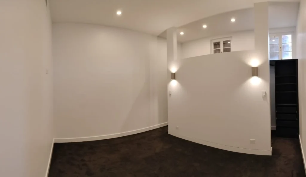
Lighting is one of the biggest factors affecting paint colour.
The colour you see on a sample card is not necessarily the colour you will see on the wall.
Natural light changes throughout the day, while artificial lighting can change the appearance again at night.
Dulux Australia also recommends testing colours in the actual space because natural and artificial lighting can significantly affect how a colour appears.
Morning light
Morning light can have a different character from afternoon light.
A colour that looks soft and neutral in the morning may appear warmer or cooler later in the day depending on the room’s orientation and surrounding environment.
Afternoon light
Strong afternoon sunlight can make some colours appear brighter and more intense.
This is particularly important in rooms that receive strong direct sunlight.
Artificial light
Don’t make your final decision based only on daylight.
Turn on:
- Ceiling lights
- Downlights
- Floor lamps
- Table lamps
- Pendant lights
Then look at the sample again.
The type and colour temperature of your lighting can influence how the paint appears.
A useful rule
Never judge a paint colour from a tiny sample alone.
Test it in the room where it will actually be used.
Pay Attention to Undertones
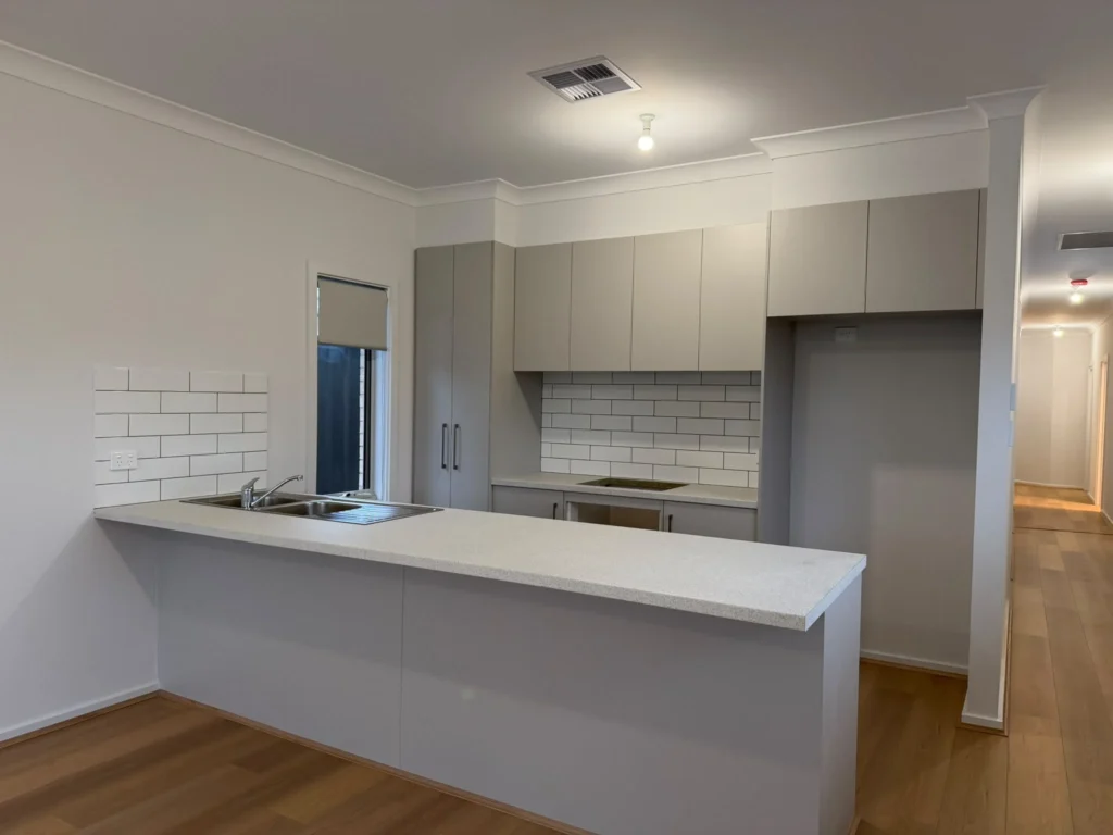
This is one of the most important parts of how to choose paint colour.
Two colours may both appear to be white, beige or grey, but their undertones can make them look completely different.
For example:
White
- Warm white
- Cool white
- Neutral white
Grey
- Blue-grey
- Green-grey
- Purple-grey
- Warm grey
Beige
- Yellow-beige
- Pink-beige
- Grey-beige
These subtle differences can become much more noticeable once the colour covers an entire wall.
Why undertones matter
Imagine choosing a neutral grey for a room with warm timber flooring.
If the grey has a strong blue undertone, the contrast may be more obvious than expected.
Alternatively, a warm greige may connect more naturally with the timber.
This does not mean you should never mix warm and cool colours.
It simply means you should understand what you are combining.
How to Choose Exterior Paint Colours
Choosing exterior paint colours requires a different approach from choosing colours for an interior room.
You need to consider the entire facade.
Look at:
- Roof colour
- Brick
- Render
- Stone
- Windows
- Garage door
- Front door
- Fascia
- Gutters
- Driveway
- Landscaping
- Neighbouring homes
The exterior colour should work with these elements rather than competing with them.
Main exterior colour
This usually covers the largest visible surface.
A neutral or muted colour can provide a versatile foundation.
Trim colour
Windows, doors and architectural details can be highlighted with a contrasting or complementary colour.
Front door
The front door provides an opportunity to introduce a stronger accent without painting the entire house a bold colour.
Roof and gutters
Don’t select the wall colour without considering the roof.
A wall colour that looks good in isolation may clash with a strongly coloured roof.
Adelaide conditions
Exterior surfaces in Adelaide can receive significant sun and weather exposure.
That means colour selection should be considered alongside the condition of the substrate and the suitability of the coating system.
If the exterior requires repainting, preparation is just as important as the colour itself.
You can also explore our residential painting services in South Australia if you are planning a complete home repaint.
Create a Colour Flow Between Rooms
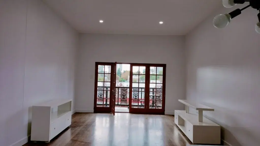
One of the best sources of inspiration may already be inside your home.
Take a look at your furniture and finishes.
For example:
Warm timber + cream furniture
A warm neutral, soft beige or muted earthy colour may create a cohesive scheme.
Grey sofa + white cabinetry
A soft grey, neutral white or carefully selected cool colour may work well.
Natural stone + timber
Earthy colours, muted greens, warm whites and natural neutrals can complement these materials.
Bold furniture
If your furniture already has strong colours, a quieter wall colour may allow those pieces to remain the focal point.
The goal is not to make every element exactly the same colour.
A successful room usually has some contrast.
Test Paint Colours Before You Commit
This is perhaps the most practical piece of advice in the entire article.
Test the colour before painting the whole room.
Do not rely entirely on:
- Online images
- Pinterest photos
- Small colour cards
- Someone else’s house
- Paint colours shown on your phone
Colours can look different depending on the screen, lighting, surrounding materials and surface.
Dulux recommends testing samples in the actual home and observing them at different times of day and under artificial lighting.
Test more than one option
Instead of testing one colour, put two or three close alternatives next to each other.
You may quickly discover that the colour you initially preferred isn’t the one that looks best in the room.
Look at the sample at different times
Check it:
Morning → Afternoon → Evening → Artificial light
Give yourself time to live with it.
Dulux recommends leaving samples up for several days before making the final decision.
Feature Walls: When They Work and When They Don't
Feature walls can add character without requiring every wall to be bold.
They can work particularly well behind:
- Beds
- TV units
- Fireplaces
- Dining areas
- Desks
- Architectural features
But a feature wall should have a reason for being there.
Advantages
- Adds visual interest
- Creates a focal point
- Allows you to experiment with stronger colours
- Can highlight architectural features
- Uses less bold paint than covering an entire room
Potential disadvantages
- Can look disconnected if the colour does not relate to the rest of the room
- May make an already small or dark room feel heavier
- Can date more quickly if chosen purely around a short-term trend
A feature wall works best when it feels intentional.
Painting Services in Adelaide
Choosing the right colour is only half of a successful painting project.
The surface underneath needs to be properly prepared, and the paint needs to be applied according to the requirements of the product and substrate.
If you’re planning a painting project in Adelaide, SA Prep and Paint Services Pty Ltd provides residential and commercial painting services across Adelaide and surrounding areas.
Services include:
- Interior painting
- Exterior painting
- Residential painting
- Commercial painting
- Wall painting
- Roof painting
- Repainting
- Surface preparation
You can learn more about:
- Residential Painting Services in South Australia
- Professional Commercial Painting Services
- Professional Interior Painting Services in Paralowie
- Professional Wall Painting Services
- Professional Roof Painting Services
Ready to Refresh Your Home?
Don’t choose a colour based on a small sample alone.
Test it in your own space, consider the lighting and surrounding finishes, and make sure the surface is properly prepared before painting.
Recent Posts

How to Prepare Walls for Painting: An Adelaide Homeowner’s Guide
Learn how to prepare walls for painting in Adelaide with simple steps for cleaning, repairing, sanding and priming surfaces to...
How to Choose the Right Paint Finish for Every Room in Your Adelaide Home
Learn how to choose the right paint finish for every room in your Adelaide home, from living rooms and bedrooms...
Interior vs Exterior Paint: What Adelaide Homeowners Need to Know
Learn the key differences between interior and exterior paint, including durability, weather resistance, finishes and surface requirements. Discover how Adelaide...
+61 470 480 710
Contact and Whatsapp
saprepandpaintservices@outlook.com
contact us, we are available 24/7
Frequently Asked Questions
How do I choose the right paint colour for my home?
Start by considering the room’s natural light, existing furniture, flooring, cabinetry and the mood you want to create. Test several colours in the actual space before making your final decision.
What is the best colour for a small room?
Light colours and soft neutrals can help create a more open and airy appearance, but darker colours can also work when you want a more intimate or dramatic atmosphere. Lighting and the overall room design are important factors.
How do I choose wall colours that work together?
Choose a main colour and then select supporting shades that share a similar undertone or work well together. Consider how the colours will look from adjoining rooms, particularly in open-plan homes.
Why does the same paint colour look different in different rooms?
Natural light, artificial lighting, surrounding colours, flooring, furniture and the direction a room faces can all affect how a paint colour appears.